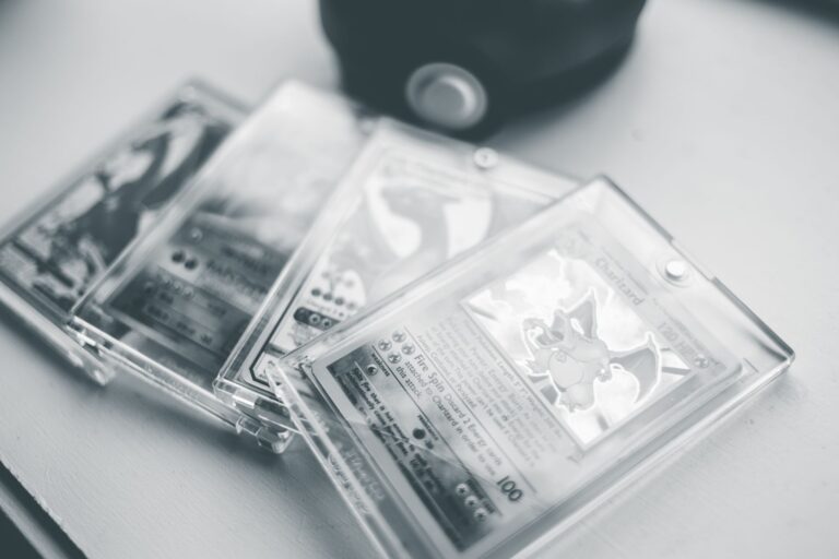
Yes, eye appeal can absolutely matter more than the numerical grade on a Pokemon card. A card graded PSA 8 that looks absolutely pristine to the eye often commands more collector interest and stronger prices than a technically graded PSA 9 that suffers from heavy centering issues, dark borders, or an off-color surface. The grade number represents a standardized assessment across multiple factors, but it’s a summary, not a complete picture of how a card actually looks or feels when you hold it in hand. Consider a 1999 Charizard graded PSA 8 with sharp corners, perfect centering, and brilliant color saturation. It will easily outsell a PSA 9 version of the same card with severe centering, faded holo, and visible print lines—even though the numerical grades suggest otherwise.
The disconnect between grade and appeal exists because grading is inherently reductive. Graders assign a single number based on defined criteria, but they can’t capture the subjective experience of a collector who opens a slab and sees either a gem or a disappointment. The market knows this, and savvy collectors bid accordingly. They’re not just buying a number; they’re buying the card they’ll want to own and display. This reality has profound implications for how you should approach card collecting, buying, and pricing in today’s market.
Table of Contents
- How Numerical Grades Fail to Capture Visual Reality
- The Surface and Borders Problem That Graders Underestimate
- How Collectors Actually Price Cards Based on Appeal
- How to Personally Assess Eye Appeal and What You’re Actually Seeing
- The Dark Borders and Subjectivity Trap
- How Photography and Presentation Shape Perceived Appeal
- The Shifting Collector Mindset Toward Authenticity and Enjoyment
- Conclusion
- Frequently Asked Questions
How Numerical Grades Fail to Capture Visual Reality
A card’s assigned grade reflects a specific moment in a grading company’s assessment process, but many factors that affect collector appeal don’t weigh equally in the grading formula. Centering, for instance, can be catastrophic to eye appeal even when it only costs a card a single grade point. A PSA 8 card that’s off-center by 40/60 will look noticeably wrong when you view it face-on, yet it still carries the same grade number as a perfectly centered PSA 8. The human eye is remarkably sensitive to symmetry, and you notice centering problems immediately—far more than you notice the subtle surface wear that might separate a PSA 8 from a PSA 7. Color saturation is another critical but underweighted element. Some holographic surfaces age beautifully; others fade or discolor unevenly.
A card might meet the technical specifications for PSA 8, but if the holo has taken on a muddy or yellowed tone, collectors perceive it as visually inferior. The grade doesn’t change, but the market does. Print quality also varies within a single print run. Some 1st Edition base Set Bulbasaurs came off the press with crisp, vibrant graphics; others emerged slightly washed out or with registration issues. Neither affects the grade meaningfully, but one will always look superior on the shelf. When you’re evaluating a card you’re considering buying, ignore the impulse to trust the number and instead scrutinize high-resolution photos from multiple angles.
The Surface and Borders Problem That Graders Underestimate
Surface quality and border darkness represent the clearest mismatch between assigned grades and collector perception. A card with light surface wear but excellent borders will photograph beautifully and feel premium in hand, even if its PSA 8 grade is the same as a card with pristine surface but heavily darkened, grayish borders. Border wear is permanent and visible from six feet away. Surface imperfections often disappear entirely when the card is housed in a slab, masked by the plastic and lighting. Yet both factors contribute equally to the grade, and collectors almost universally care more about borders than surface.
Darkened borders are particularly deceptive because they’re often caused by manufacturing inconsistency, not handling. A card fresh from a 25-year-old sealed pack might have had black borders from the moment it was printed. That card cannot improve, cannot be restored, and will look dated next to a card with bright white borders. The limitation here is critical: if you’re paying for eye appeal, and eye appeal factors in border color, you must inspect borders directly. Blurry photos and glare can hide border defects, so request detailed shots or examine the card in hand before committing to a significant purchase. The subjectivity of “darkness” also means you might perceive borders differently than the grader did—so verify your own assessment.
How Collectors Actually Price Cards Based on Appeal
The Pokemon secondary market has quietly developed a two-tier pricing system: one tier based on the assigned grade, and a second based on the collector’s assessment of eye appeal. High-appeal PSA 8 cards often sell for 20-40% premiums over standard-appeal PSA 8 copies of the same card. This isn’t reflected in price guides, which list a single PSA 8 price regardless of visual quality, so informed collectors exploit the gap. A brilliant-looking PSA 8 Shadowless Venusaur with perfect centering, bright borders, and vibrant green holo will sell quickly at a premium. A mediocre PSA 8 copy of the same card sits longer and fetches less, even though the grade is identical.
Auction platforms and dedicated card marketplaces have made this dynamic visible. Collectors comparing multiple listings for the same card in the same grade now routinely choose the more visually appealing option, even if it costs more. The 1999 Charizard example illustrates this perfectly: twins graded PSA 8 can diverge by thousands of dollars depending on visual presentation. One sold for $8,500; its pair, with identical grade but noticeably worse centering and less vibrant color, sold for $5,200 three months later. Price guides suggested they should be worth roughly $6,000 each. The gap between guide and reality is where eye appeal lives.
How to Personally Assess Eye Appeal and What You’re Actually Seeing
The most practical skill a collector can develop is the ability to assess a card’s visual appeal independent of its grade. When you receive a card, remove it from the slab if you can (or have a grader do it), and view it in neutral light. Look at centering first—does the border appear even on all sides, or is one edge noticeably thinner? Next, examine the corners and edges for wear, and the surface for scratches, dents, or indentations. Then assess color: does the holo look fresh and vibrant, or has it aged to an orange or brown tone? Finally, check the borders themselves for darkness, wear, or discoloration. Compare your assessment to the assigned grade.
If your eye says the card looks better than the grade suggests, you may have found an underpriced gem. If your eye says it looks worse—perhaps the centering bothers you more than the grader indicated—you know the market price might be too high for your preferences. The tradeoff here is that eye appeal is subjective. What looks flawless to one collector looks merely good to another. That subjectivity is why you need to inspect cards yourself rather than relying on photos or grading company assurances. Photos lie; they flatten the card, hide centering imperfections, and often apply generous lighting that masks color issues.
The Dark Borders and Subjectivity Trap
Border darkness is the single most common source of disagreement between assigned grades and collector perception. Some cards are graded 8 or 9 despite having noticeably dark or gray borders, especially older cards from the 1999-2001 print runs. The reason is that border darkness is partly manufacturing quality, not just handling. A Shadowless card with black borders from day one is technically still a high-quality print; the manufacturing inconsistency doesn’t reduce its “grade” in the technical sense. But collectors visual perception says it’s less appealing than a card with bright white borders, so the market prices it accordingly.
The warning here is that you cannot rely on a high grade to ensure bright borders. Examine border photos carefully, and ask sellers directly whether borders are naturally dark or darkened by handling. Some cards are simply darker from the factory. If border brightness matters to your aesthetic preferences—and it should, since you’ll be looking at the card—factor that into your purchasing decision independent of the assigned grade. Similarly, subjectivity around centering and color means a card graded 8 by one company might grade 7 by another, and the difference has less to do with the card’s actual appearance than with the company’s grading standards. This is why comparing cards across different grading companies is always risky.

How Photography and Presentation Shape Perceived Appeal
The way a card is photographed dramatically affects how collectors perceive its appeal before they ever hold it. Natural light reveals color saturation and border condition far better than flash photography, which creates glare and hides centering flaws. Smart sellers photograph their high-appeal cards in bright, diffuse light, from multiple angles, and without reflections. They photograph the back and corners as well as the front. When you’re evaluating cards for purchase, distrust listings with single photos, flash photography, or glare-heavy shots.
Request additional images or pass on the card. A genuinely beautiful card will be easy to photograph; if the seller can’t or won’t provide clear images, that’s often a sign the card has something to hide. Conversely, a card photographed beautifully might still disappoint in hand if the photography concealed flaws. This is why in-person inspection or dealing with high-reputation sellers who accept returns is critical. Professional graders photograph cards under controlled conditions, which is another reason their photos often make cards look better than they appear in natural light. You’re comparing your real-world experience to a curated professional photo, which is inherently unfair to the card.
The Shifting Collector Mindset Toward Authenticity and Enjoyment
The Pokemon card market is gradually shifting away from pure grading metrics toward a more nuanced appreciation of individual card aesthetics. Younger collectors especially are less concerned with owning a PSA 10 that looks mediocre and more focused on owning a PSA 8 or 7 that they genuinely love looking at. This shift is healthy for the hobby because it prioritizes the collector’s actual experience over numeric achievement.
The future of card collecting isn’t about chasing grades; it’s about building a collection of cards you enjoy. This mindset change also means that eye appeal will continue to diverge from assigned grades in terms of market value. As more collectors invest in understanding what actually makes a card appealing rather than just trusting grades, the demand for genuinely high-appeal cards will grow, and the supply of mediocre grades from prestigious companies will become less appealing. For collectors entering the hobby now, the implication is clear: develop your own eye, trust it, and prioritize cards you actually enjoy owning over cards that merely satisfy a numeric benchmark.
Conclusion
Eye appeal matters more than the slab number because collectors ultimately live with their cards, and visual satisfaction trumps technical grading metrics every single time. A PSA 8 that looks stunning in hand beats a PSA 9 that disappoints when you actually examine it. The secondary market has learned to price cards accordingly, creating opportunities for informed collectors to find undervalued gems and avoid overpriced duds that happen to carry impressive grades. The disconnect between grades and appeal is a feature of the grading system itself—numbers are reductive by nature, and they can’t capture the subjective, visual experience of owning a beautiful card. Moving forward, focus on developing your own ability to assess card appeal independent of grades.
Examine centering, borders, color, surface, and corners yourself. Ask sellers for detailed, unglare photos. Understand that subjectivity in grading means two PSA 8s are not always equal. When you find a card that genuinely appeals to you visually, bid confidently even if the grade suggests there’s “better” out there. You’re not buying a number—you’re buying an object you’ll enjoy for years. That satisfaction is worth far more than whatever the slab says.
Frequently Asked Questions
Does a lower grade card always cost less than a higher grade card?
No. A PSA 8 with exceptional eye appeal often sells for more than a PSA 9 or even PSA 10 with poor centering, dark borders, or faded color. The assigned grade is one factor, but buyer perception of visual quality is equally important.
How do I know if a card’s borders are naturally dark or darkened by handling?
Request photos of the back of the card under bright, natural light. Naturally dark borders are uniform and consistent from factory production. Worn borders show handling marks, gradual darkening, or uneven wear patterns. Ask the seller directly—reputable sellers will be honest.
Should I ever buy a card I haven’t seen in person?
Only from sellers with excellent return policies or strong reputation. Request high-resolution photos from multiple angles, including the back and edges. Even then, in-person inspection is always safer for significant purchases.
Why do different grading companies assign different grades to the same card?
Grading standards vary between companies. PSA, BGS, and CGC all weight factors like centering, borders, and surface differently. This is why comparing cards graded by different companies is risky—a PSA 8 might be closer to a CGC 7 or 9 depending on what the grader emphasized.
Can I improve a card’s grade by cleaning or pressing it?
No. Any attempt to alter a card disqualifies it from reputable grading companies. The card’s condition is permanent. If a card’s borders are dark or centering is off, those issues are fixed—only your purchasing decision can change.
What’s the biggest mistake collectors make when buying graded cards?
Trusting the grade number alone without inspecting the card visually. Collectors often buy cards based on grades without considering whether the visual appearance actually appeals to them. Always verify that the card looks as good as the grade suggests before committing to a purchase.