When you’re buying or selling a Pokemon card, the grade number assigned by a third-party grader tells only part of the story. A card graded 8 (Near Mint/Mint) that displays obvious wear, centering issues, or print defects will always be less desirable than a visually flawless card graded 8, even though both carry the same numerical designation. Eye appeal—the aesthetic quality of a card as you hold it in hand—often determines a collector’s willingness to pay and their long-term satisfaction with the purchase. A card’s true market value depends heavily on how well it actually looks, not just what the holder says.
Consider a 1999 Shadowless Charizard graded PSA 7. If it has a clean surface, sharp corners, and good centering, collectors will pay premium prices despite the moderate grade. The same card with identical PSA 7 label but plagued by print spots, dull borders, or visible wear might struggle to find buyers at any reasonable price. This reality exists because serious collectors—and they drive the market—prioritize owning cards they enjoy looking at. The grade is a starting point; eye appeal closes the deal.
Table of Contents
- What Determines Eye Appeal Beyond the Technical Grade?
- The Grading System’s Limitations and Why Visual Inspection Matters
- How Centering and Surface Quality Shape Collector Preference
- The Market Premium for High Eye Appeal Cards
- Common Pitfalls and Why Photos Don’t Always Reveal Eye Appeal
- Building a Collection That You Actually Enjoy Owning
- The Future of Card Grading and Eye Appeal Evaluation
- Conclusion
What Determines Eye Appeal Beyond the Technical Grade?
Eye appeal encompasses several visual elements that grading companies evaluate but that don’t always align perfectly with the numerical grade itself. Centering, the alignment of the card’s border on all four sides, is one of the biggest factors. A card can receive the same grade as another while having noticeably worse centering—one might have borders that feel balanced, while the other has the image shifted clearly to one side. Most collectors immediately notice this difference and factor it into their perceived value, even if both cards share the same grade designation.
Print quality also plays a massive role in eye appeal. Some production runs of older sets had cleaner, sharper print jobs than others, and individual cards vary in how crisp the colors appear and whether they have printing lines or spots. A card from a clean print run with vibrant colors that practically jump off the surface will always look more appealing than a duller card from a weaker print run, regardless of condition grade. Similarly, surface reflectivity and the depth of color saturation matter to collectors far more than the grade number might suggest.

The Grading System’s Limitations and Why Visual Inspection Matters
Professional grading services use standardized criteria to assign numerical grades, but their assessments are snapshots in time based on specific, measurable defects like creases, stains, or corner wear. The grader might assign a PSA 8 to two different cards, both with acceptable flaws for that grade, yet one looks noticeably more attractive to the human eye. The grading system isn’t designed to capture subjective beauty or the intangible quality that makes collectors reach for their wallets—it’s designed to be consistent and repeatable.
This limitation means you need to do your own visual assessment before buying, especially in the secondary market. High-resolution photos from multiple angles can reveal issues that don’t significantly affect the numerical grade but devastate eye appeal. Centering problems, print lines, and color issues might not lower a grade, but they’ll be the first things you notice when you hold the card. Many collectors have experienced the disappointment of receiving a card in hand that looked better in the graded holder than in reality—the grade was accurate, but the eye appeal didn’t match expectations.
How Centering and Surface Quality Shape Collector Preference
Centering is often the deciding factor for collectors choosing between two cards with identical grades. A perfectly centered Charizard from Base Set with clean, well-aligned borders at the front of a collection holds more pride of ownership than an off-center version of the same card. This doesn’t just affect personal satisfaction—it directly impacts resale value. Dealers and serious collectors actively seek well-centered examples and will pay measurably more for them, sometimes 20-40% above market price for truly exceptional centering.
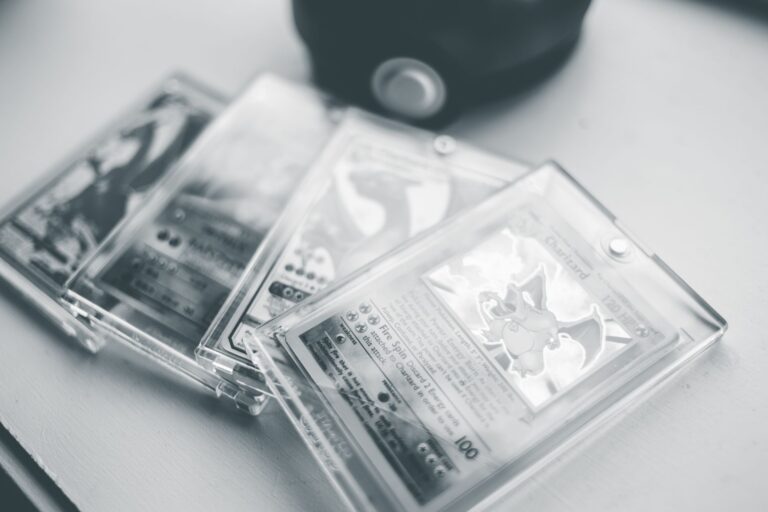
Surface quality—the texture and appearance of the card’s face—is equally critical. A smooth, pristine surface with no visible damage or discoloration feels and looks premium, even if the grade is modest. Conversely, a card with noticeable surface wear, light scratches, or areas where the coating has dulled will feel diminished in hand despite a respectable grade. The first thing most collectors do when handling a graded card is look through the top of the slab—if the surface quality is visually apparent even through the holder, that card has strong eye appeal. If flaws are immediately visible, eye appeal suffers significantly.
The Market Premium for High Eye Appeal Cards
Experienced collectors and dealers regularly see cards with exceptional eye appeal command price premiums over comparable graded examples. A PSA 7 Blastoise with flawless centering and clean surfaces might sell for 30-50% more than another PSA 7 Blastoise with soft corners and mediocre centering. This premium reflects the reality that collectors are willing to pay for visual excellence, not just a numerical score. The practice of “cherry-picking” grades—seeking out graded cards that look notably better than the grade suggests—exists precisely because eye appeal and numerical grade don’t always align.
However, there’s a tradeoff worth considering. Pursuing perfect eye appeal often means accepting a lower grade or paying substantially more for that same grade. A PSA 6 Gyarados with exceptional centering and pristine surfaces might be more satisfying to own than a PSA 7 with mediocre eye appeal, and it could cost significantly less. Some collectors prioritize the grade itself and expect all cards of that grade to have comparable eye appeal, leading to disappointment. Others prioritize owning cards they genuinely love looking at, even if that means accepting a lower or mixed grade.
Common Pitfalls and Why Photos Don’t Always Reveal Eye Appeal
Buying Pokemon cards online carries inherent risk because photographs—even high-quality ones—don’t always accurately represent eye appeal. Lighting can hide or exaggerate centering issues, shadows can mask print defects, and the camera angle might not show damage that’s obvious in person. Many collectors have purchased cards based on seller photos only to find the eye appeal was significantly worse than expected. Professional photography by dealers can mitigate this, but casual seller photos often mislead.
Additionally, slabbed cards present a unique challenge: the plastic holder adds its own visual layer that can either enhance or obscure eye appeal. A card that looks outstanding in a slab might lose appeal when viewed loose, or vice versa. Glare from the slab can hide surface issues, and the framing of the holder affects how you perceive centering. Before committing to a high-value purchase, especially of older or rarer cards, request multiple detailed photos at different angles or find the card at a local shop where you can examine it in person.

Building a Collection That You Actually Enjoy Owning
Eye appeal becomes increasingly important as you mature as a collector. Early in the hobby, many people focus on completing sets or owning specific cards regardless of condition. Over time, the priority shifts—collectors want cards they’ll keep and display with pride, not cards they’re embarrassed to show. This is why many experienced collectors would rather own a PSA 6 that looks exceptional than a PSA 8 that looks mediocre.
The former brings satisfaction every time you look at it; the latter brings regret. When building your collection, prioritize cards that make you happy to own. This means sometimes accepting a lower grade for a card with excellent eye appeal, or spending extra to find the rare example of a high grade that looks as good as it should. Your collection reflects your tastes and standards—eye appeal ensures that those standards align with what you actually see when you open the protective sleeves.
The Future of Card Grading and Eye Appeal Evaluation
As the Pokemon card market matures, grading companies are beginning to recognize that numerical grades alone don’t fully capture what collectors value. Some services now offer subgrades for different aspects—centering, corners, edges, and surface—which provide more granular information about eye appeal. This trend will likely continue, giving buyers better tools to assess whether a card’s visual quality matches their preferences before purchase.
The future may also see more emphasis on condition consistency, where grading companies explicitly flag cards that punch above or below their grade in terms of eye appeal. This transparency would help collectors make more informed decisions and better match their expectations with reality. In the meantime, the lesson remains clear: the number on the slab is a guideline, not a guarantee. Eye appeal is what you actually own.
Conclusion
The Pokemon card market ultimately runs on eye appeal, regardless of numerical grades. A card’s true value lies in its visual impact—the centering, surface quality, and overall aesthetic that make collectors want to own it. While grading services provide a useful standardized framework, they can’t capture the full picture of what makes a card desirable. The most satisfied collectors are those who prioritize visual quality alongside or sometimes over the grade itself.
When shopping for cards, invest time in learning to assess eye appeal independently of the grade. Look at centering, surface condition, and print quality with your own eyes. Don’t let a high grade mislead you into accepting poor eye appeal, and don’t overlook lower-graded cards that genuinely look exceptional. The cards you’ll love most are those that look as good in hand as they do in your mind, and that standard transcends any numerical designation.