Pokémon card design has undergone a dramatic transformation since the Trading Card Game’s debut in October 1996, evolving from simple, artist-driven designs created by Ken Sugimori, Mitsuhiro Arita, and Keiji Kinebuchi into the technically sophisticated, full-art compositions that dominate shelves today. The original Base Set of 102 cards featured a dark blue card back with “Pocket Monsters Card Game” text and a simpler Poké Ball graphic, a stark contrast to the dynamic, button-like Poké Ball centered in a blue swirl design introduced when the cards reached the United States in January 1999. This 29-year journey from Japan to global phenomenon reflects not just changing artistic preferences, but fundamental shifts in how Pokémon approached rarity, visual appeal, and collector engagement.
The card design evolution has been inseparable from market growth. What started as 69 Pokémon, 26 Trainer cards, and 6 Energy cards has expanded into a global phenomenon that has sold over 75 billion cards total, generating USD 2 billion in sales during 2024 alone. Understanding how design choices shaped this growth—from the introduction of holographic rares that increased perceived value, to the strategic use of full-art alternate versions that create collecting tiers—reveals why certain design eras command premium prices and why collectors obsess over subtle differences between printings.
Table of Contents
- How Did Early Card Design Establish the Foundation?
- What Design Changes Accompanied International Expansion?
- Why Did Card Art Remain Relatively Consistent Until 2011?
- How Did the 2011 Black & White Redesign Modernize Card Aesthetics?
- What Are the Latest Design Innovations (2024-2025)?
- How Do Condition and Variant Rarity Influence Card Value?
- What Does the Future Hold for Pokémon Card Design?
- Conclusion
How Did Early Card Design Establish the Foundation?
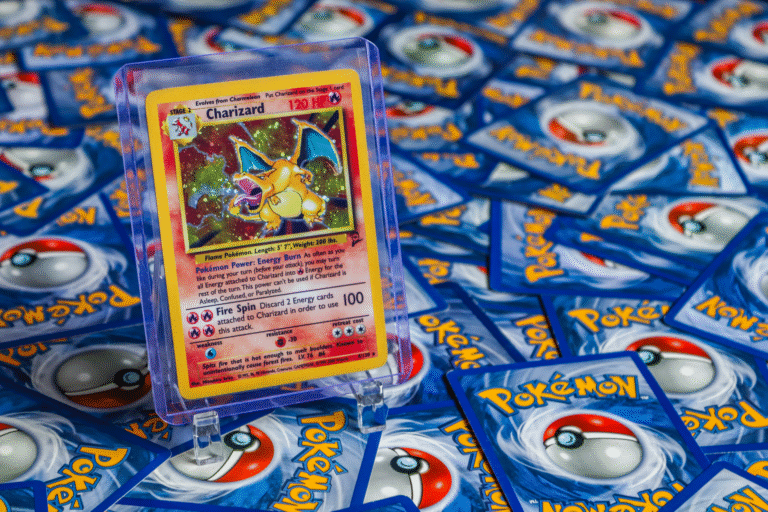
The original 1996 Japanese Base Set included 16 holographic rares and 16 regular rares, immediately establishing rarity as a core design principle. The 102-card lineup featured mixed artistic approaches: some cards used real photographs, others employed 3D graphics, and many incorporated hand-drawn art, often sourced from the stock image collection “Datacraft Sozaijiten.” This eclectic aesthetic gave early Base Set cards a distinctive character that modern uniform design standards cannot replicate. The Charizard from the 1996 Japanese Base Set, still the top trending card from that era, exemplifies how impactful these early designs were—its hand-drawn appearance and holographic treatment created a visual standard that collectors still prize nearly three decades later.
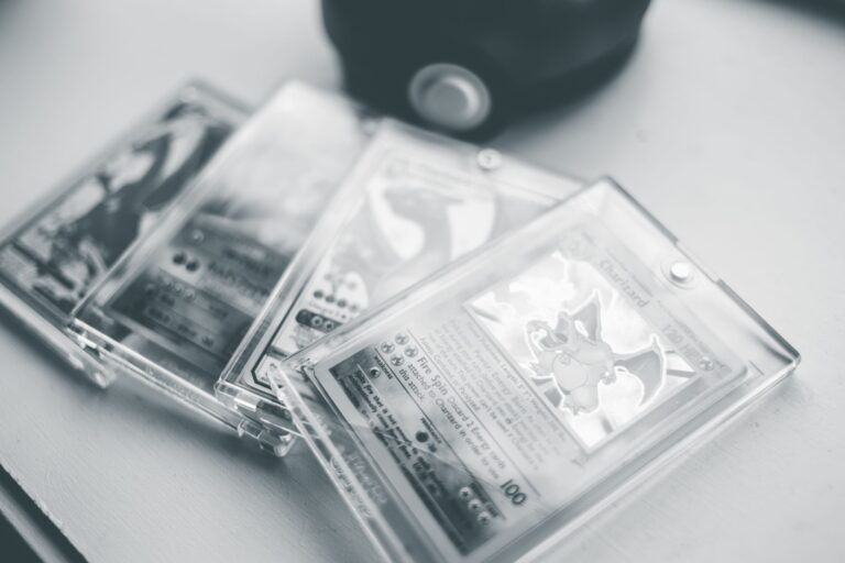
Early production also introduced a subtle but significant variant: “Shadowless cards” lacking the drop shadow on borders. This printing variation later corrected in Unlimited releases became a critical condition marker for collectors and a driver of price premiums. The Base Set has more variants than any other released set, with 1st Edition cards existing for every language except Japanese. This abundance of variants—combined with the newness and rarity of the first English release in 1999—has made Base Set cards a foundational investment category for serious collectors.

What Design Changes Accompanied International Expansion?
When wizards of the Coast published the Trading Card Game in the United States on January 9, 1999, they didn’t simply reprint the Japanese cards. Instead, they updated the card design with the now-iconic English “Pokémon” logo and redesigned the card back with that dynamic, centered Poké Ball and blue swirl. This decision proved crucial: the American card back became the standard for English-language releases globally, while the original Japanese design remained exclusive to Japanese cards. This geographic split means that Base Set cards exist in two visually distinct versions, and collectors often treat them as separate collecting categories with different price trajectories.
The international expansion also normalized holographic cards as a defining feature rather than a novelty. Reflective foil backgrounds on rares became the expected standard, increasing both visual appeal and perceived value. However, this introduced a weakness that collectors must manage: a single scratch on a holographic surface can drop card value by 50% or more. The decision to make holos visually dominant created a collecting hierarchy that persists today—non-holographic cards from the same era sell for a fraction of their holographic equivalents, even if their rarity is identical on paper.
Why Did Card Art Remain Relatively Consistent Until 2011?
From 1999 through 2010, Pokémon’s design philosophy remained conservative, with incremental changes to the card template while artist rosters gradually expanded. The card layout stayed recognizable: illustration area at the top, attack/ability descriptions in the center, and stats and type indicators at the bottom. Holographic rares continued to feature the reflective backgrounds that became synonymous with collectibility.
This consistency created a clear visual lineage that modern collectors can trace—you can instantly identify a card’s approximate era by its frame design and foil pattern. The consistency also meant that artistic quality became the primary differentiator between sets and individual cards. Early Base Set artists like Keiji Kinebuchi and Mitsuhiro Arita became recognizable names to collectors, with certain artists commanding premium prices for their particular styles. This artist-centric collecting culture, established during this 12-year period, continues today, particularly in the modern era where full-art and special illustration rares often credit individual artists and create dedicated fan bases around specific illustrators.

How Did the 2011 Black & White Redesign Modernize Card Aesthetics?
The 2011 Pokémon TCG Black & White series introduced revamped designs that abandoned the conservative template approach. Cards featured modern, sleek designs with clean lines, vivid colors, and minimalist motifs that felt contemporary and polished. This redesign signaled that Pokémon was willing to evolve its visual language to maintain relevance to younger players while maintaining sophistication for adult collectors. The cleaner borders, refined typography, and more spacious layouts made the cards feel premium and intentional in a way that the slightly cramped earlier templates could not achieve.
The 2019–present Sword & Shield era took modernization further by introducing full-art designs where illustrations covered the entire card, not just the designated artwork box. Alongside these full-art cards came alternate art versions, providing unique interpretations of the same Pokémon and creating multiple collectible versions of popular cards. This design strategy transformed how collectors approach building sets—rather than completing a single version of each card number, the modern era encourages chasing multiple artistic interpretations. The downside is clear: pursuing all variants of popular Pokémon can become expensive and consume collection space quickly, making prioritization essential for collectors on limited budgets.
What Are the Latest Design Innovations (2024-2025)?
The most recent releases showcase design experimentation at unprecedented levels. Scarlet & Violet—Prismatic Evolutions, released January 17, 2025, featured Special Illustration Rares (SIRs) with an Eevee and Eeveelutions theme that pushed artistic boundaries. Scarlet & Violet: Journey Together, released March 28, 2025, introduced a novel concept: trainer-Pokémon combination cards where the two subjects share a cohesive illustration space. This release also headlined Hyper Rare cards featuring prominent trainers like N, Lillie, Iono, and Hop—a design choice that recognizes the human characters in the Pokémon narrative, not just the creatures themselves.
The Masks of Ogrepon release on June 13, 2025, introduced the exclusive Twilight Mask grade stamp, a security and aesthetic feature designed to combat counterfeiting while adding visual distinctiveness. Looking ahead, the 2026 Mega Evolution: Ascended Heroes set launching January 30, 2026, will feature 13 Mega Evolution Pokémon ex with over 290 cards total and a new Mega Attack Rare rarity. This set will return to full-art designs paired with retro katakana attack text, blending modern aesthetics with nostalgic callbacks to the original Japanese designs. The limitation collectors should note: design innovation cycles are accelerating, meaning yesterday’s cutting-edge card design becomes dated faster than ever before, which can impact long-term value perception.

How Do Condition and Variant Rarity Influence Card Value?
Card condition forms the bedrock of value assessment for vintage designs, particularly for early Base Set cards where age and handling have created natural separation between mint and played specimens. A single scratch on the holographic surface—visible only under close inspection or proper lighting—can reduce a card’s value by 50%, which means the difference between a PSA 8 and PSA 9 grade can represent thousands of dollars for premium cards. The Charizard 1996 Japanese Base Set #6 Holo exemplifies this principle: the same card can range from several hundred dollars in lightly played condition to tens of thousands in pristine state.
Shadowless versus Unlimited variants create additional tiers within the Base Set itself. 1st Edition cards command a significant premium over Unlimited printings of identical artwork, while shadowless cards occupy a price category between them. These variants exist because of production decisions made 25 years ago—collectors today are essentially paying for the accident of early printing runs. This historical contingency means that seemingly minor design or production variations have calcified into permanent value categories.
What Does the Future Hold for Pokémon Card Design?
The upcoming Mega Evolution: Ascended Heroes set signals a design direction that blends nostalgia with innovation—a strategy that acknowledges collector sentiment toward iconic designs while refusing to simply repeat the past. The deliberate inclusion of retro katakana attack text in a 2026 set demonstrates how modern design can honor legacy while pursuing visual distinctiveness. With the global trading card game market projected to reach USD 14.12 billion in 2025 and the physical TCG segment valued at USD 7 billion projected to reach USD 13.5 billion by 2035, design innovation remains critical to maintaining collector engagement and market growth.
The emergence of Pokémon TCG Pocket as a complementary digital platform—which generated USD 165 million in in-app purchase revenue during its first month and USD 55.93 million in June 2025—suggests that design philosophy may begin to bridge digital and physical experiences. Collectors should anticipate that successful digital card designs might influence physical card releases, creating cross-platform design coherence. The challenge for Pokémon going forward will be maintaining the tactile, material appeal of physical cards while competing with the frictionless engagement of digital alternatives.
Conclusion
The history of Pokémon card design from 1996 to 2025 is ultimately a story of growth constrained by clarity. The original Base Set established a template so effective—limited colors, clear hierarchies, holographic rares as the ultimate prize—that departing from it took nearly 15 years. Once Pokémon committed to modernization in 2011 and full-art exploration in 2019, design evolution accelerated dramatically. Today’s collector faces not just single-card variants but entire parallel universes of alternate art versions, special rarities, and innovative frame treatments.
For collectors, the implication is clear: understanding which design eras and variants hold long-term appeal requires historical literacy. Base Set cards benefit from age, scarcity, and the nostalgia factor that makes early releases perpetually compelling. Modern cards benefit from technical sophistication and variety that creates multiple price tiers within single sets. The safest collecting strategy remains purchasing across eras—vintage for historical significance and value stability, modern for contemporary aesthetics and the chance to witness design evolution firsthand.