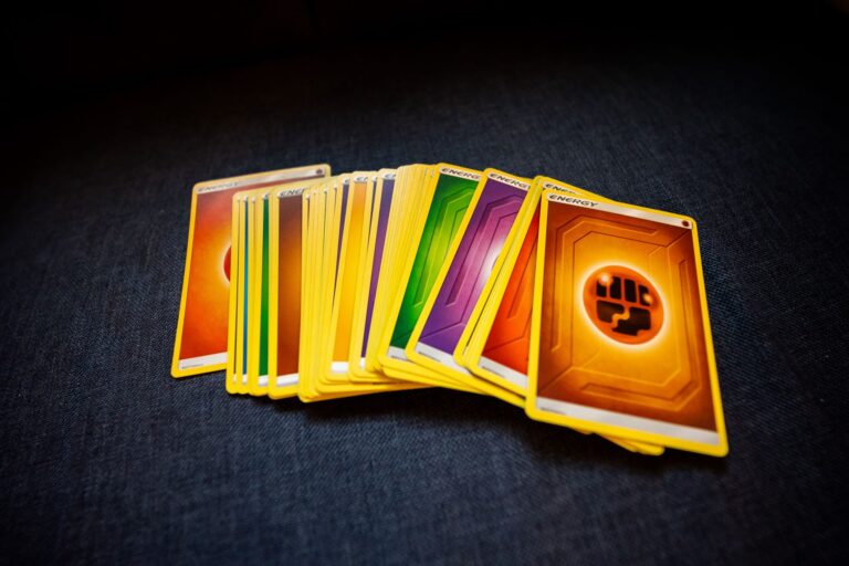
The most compelling Base Set cards often aren’t the ones with the highest print runs or clearest eye appeal—they’re the ones with printing quirks that tell a story. Hidden throughout early Pokemon card production runs are variations with distinct visual characteristics that collectors find genuinely interesting: subtle changes in ink saturation, registration shifts that create shadow effects, and paper stock differences that affect how light reflects off the card surface. One concrete example is the difference between first edition shadowless Base Set cards and their unlimited shadowless counterparts, where the same card can have noticeably different color intensity and border definition depending on when it was printed.
These aren’t errors to overlook—they’re the fingerprints of the manufacturing process that give each variation its own appeal. What makes these hidden prints worth understanding is that personality matters more than perfection in modern collecting. A Base Set Charizard with slightly misaligned colors or an unusual ink variation becomes memorable precisely because it looks different from the typical copy you see in PSA graded slabs. Collectors increasingly recognize that these manufacturing quirks represent authentic pieces of Pokemon card history, not defects to be avoided.
Table of Contents
- What Makes Base Set Printing Variations So Distinctive?
- The Challenge of Identifying Authentic Print Variations
- How Print Variations Affect Card Personality and Collectibility
- Comparing Hidden Prints to Modern Production Standards
- The Grading Problem with Subtle Print Variations
- Examples of Base Set Cards Where Print Variation Really Matters
- The Future of Base Set Print Variation Collecting
- Conclusion
What Makes Base Set Printing Variations So Distinctive?
Base Set went through multiple printing stages between 1999 and the early 2000s, and each stage introduced variations that trained collectors can identify. The early shadowless first editions have a completely different aesthetic than later shadowless unlimited cards—the borders appear cleaner, the blacks are deeper, and the overall color palette feels more saturated. As production ramped up, Wizards of the Coast adjusted printing plates and paper suppliers to meet demand, resulting in cards that feel lighter in hand and have slightly more orange or yellow undertones in their color registration. A specific example that illustrates this well is the Base Set Gyarados. First edition shadowless copies exhibit a rich, deep red in the background that shifted noticeably by the unlimited printing phase.
The unlimited shadowless versions have the same card image but with a more washed-out, pinkish quality. Neither is wrong—they simply represent different production runs. Collectors who chase the shadowless versions specifically often prefer the earlier print because that saturated color feels more intentional and striking. The practical takeaway is that these variations aren’t mistakes that lower value—in many cases, they increase collector interest because they represent rarer production windows. A Base Set card with the right combination of characteristics can command premiums precisely because fewer copies exist in that specific print variation.

The Challenge of Identifying Authentic Print Variations
Determining which variation you actually own requires careful attention to paper texture, ink density, and registration marks that most casual collectors overlook. The shadowless cards have no visible border shadows—a key identifier—but within that category, the first edition and unlimited versions still have measurable differences in how the card stock absorbs and reflects light. However, a major limitation is that these differences are often subtle enough that poor lighting or photo quality can make accurate identification genuinely difficult. Two cards that look identical in natural light can show obvious differences under specific LED illumination. this creates a real problem for grading and pricing. A card that should be identified as first edition shadowless might be mislabeled as unlimited if examined under inadequate conditions.
The reverse also happens: unlimited copies get described as first edition based on seller assumption rather than actual verification. When buying online, you’re partly dependent on the seller’s accuracy in identifying which print variation they’re actually offering. Some veteran collectors use reference material and high-quality photos to confirm, but this adds friction to transactions and creates space for honest mistakes. The warning here is that not all Base Set variations command the same premium. An unlimited shadowless card, while still desirable, typically sells for 20-40% less than a first edition shadowless in the same condition. If you’re paying first edition prices, you need to verify that claim independently before committing to a purchase.
How Print Variations Affect Card Personality and Collectibility
The real personality of a Base Set print variation emerges when you handle the card in person. Shadowless first editions have a weight and substance that feels different from later printings—the card stock is thicker and the finish has a slight sheen that reflects light in a particular way. Unlimited shadowless cards feel slightly thinner and have a more matte finish. These tactile differences matter to collectors who appreciate the physical object beyond what a graded slab shows. Consider the Base Set Blastoise as an example.
A first edition shadowless copy has almost a three-dimensional quality to the artwork because of how the ink sits on the paper stock and how the colors register. The unlimited shadowless version of the same card looks flatter by comparison, not because the artwork is different but because the printing chemistry produced slightly less vibrant color layering. Neither is objectively better, but they feel distinctly different in hand, and collectors develop preferences based on that tactile experience. This personality also comes through in how the cards age and develop patina. Shadowless cards tend to tone slightly differently as they age, with first editions often developing a subtle yellowing at the edges before unlimited copies show similar effects. This natural aging process becomes part of the card’s visual story and adds character that appeals to collectors who prefer vintage-looking cards over ones that look brand new.

Comparing Hidden Prints to Modern Production Standards
Modern Pokemon card printing is far more standardized and consistent than it was in the Base Set era. Contemporary sets go through quality control processes that eliminate most registration shifts, ink density variations, and paper stock differences. This standardization means that a random modern rare card looks virtually identical to every other copy of the same card. Base Set, by contrast, was produced across multiple facilities with varying levels of equipment precision, resulting in meaningful variation card to card. The tradeoff is that modern consistency has its own value.
A modern card’s predictability makes it easier to grade, easier to price, and easier to condition-match if you’re assembling a set. But it also means less personality—you’re buying the card, not a specific production artifact. Base Set collectors often prefer the variation precisely because it creates a tangible connection to the manufacturing moment and the historical circumstances of Pokemon’s early American release. This comparison matters when evaluating your own collecting approach. If you prefer cards as standardized collectibles with clear condition benchmarks, modern printings deliver that experience better. If you want to own something that feels like an artifact with individual character, Base Set variations offer that in ways contemporary cards simply cannot.
The Grading Problem with Subtle Print Variations
Professional graders like PSA and BGS sometimes struggle with Base Set variations because the differences are often too subtle to capture in a numerical grade. A card with unusual ink saturation or an interesting registration shift might receive the same grade as a perfectly centered, standard-print copy, even though collectors can clearly see the difference in person. This creates a pricing disconnect where two cards with identical PSA grades can have substantially different market values because of print variation differences the grades don’t explicitly address. One specific limitation is that grading companies don’t currently include print variation notation in their standard grades or labels.
This means you’re dependent on the card’s visual appearance and your own knowledge to identify variations. Some collectors have started requesting grading companies add print variation identifiers to their slabs, but that change hasn’t been widely implemented yet. For now, if you care about owning a specific print variation, you need to inspect the raw card or request detailed high-quality photos before purchase. The warning: don’t assume that a higher numerical grade automatically means a card is more desirable or valuable. A well-centered unlimited shadowless copy might grade higher than a first edition shadowless with centering issues, but the first edition could be worth substantially more to a collector who specifically wants that variation, regardless of grade.

Examples of Base Set Cards Where Print Variation Really Matters
The Base Set Charizard is the obvious example, but equally interesting are cards like the Base Set Venusaur, where first edition shadowless copies have a distinctly different green tone compared to unlimited shadowless versions. The shadowless unlimited Venusaur has a more yellow-green that some collectors find less appealing, while first edition copies have a deeper, more saturated green that matches the original artwork intent more closely. This isn’t about one being wrong—it’s about the production evolution affecting how the finished card presents.
Another strong example is the Base Set Blastoise, where the background color shift between print variations is immediately noticeable. First edition shadowless copies have a richer, deeper blue background, while unlimited shadowless versions lean more cyan. These color differences genuinely affect the card’s visual impact and how it displays in a collection.
The Future of Base Set Print Variation Collecting
As the Pokemon card market matures, there’s growing recognition that print variations represent a legitimate and important collecting category. Serious Base Set collectors are increasingly building sets organized by print variation rather than just assembling one copy of each card. This shift suggests that pricing and demand for specific print variations will continue becoming more sophisticated, with collectors willing to pay premiums for the versions they specifically prefer.
This trend also means that accurate identification and documentation of Base Set variations will become increasingly valuable. Collectors and researchers who develop expertise in identifying these subtle differences are essentially preserving manufacturing history. The “hidden” prints aren’t going anywhere, but the market’s understanding of why they matter is clearly evolving.
Conclusion
Base Set printing variations possess a kind of authenticity and personality that no modern card can replicate. These aren’t errors or manufacturing failures—they’re evidence of a specific moment in production history, artifacts of how Pokemon cards were made at scale in an era before standardized quality control. Whether you’re drawn to the deeper colors of first edition shadowless cards, the different feel of unlimited shadowless stock, or the subtle registration quirks that appear throughout early printings, the personality is genuinely there for those willing to look closely.
If you’re collecting Base Set cards seriously, understanding print variations transforms the experience from simply acquiring high-grade copies to actually engaging with manufacturing history. Start by comparing first edition shadowless and unlimited shadowless copies side by side under consistent lighting. Handle the cards yourself if possible. The differences you’ll notice aren’t trivial—they’re the fingerprints of the production process, and they’re part of what makes Base Set collecting enduringly compelling.