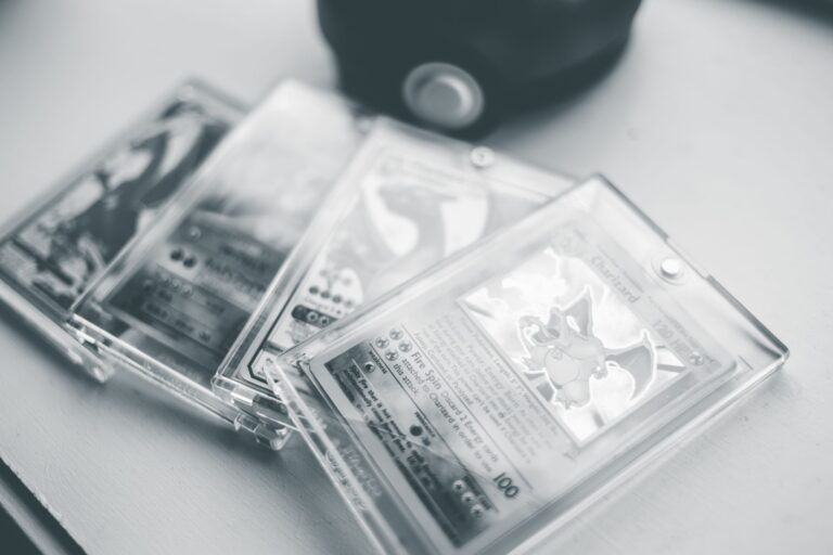
Authentic Pokémon cards share five defining characteristics that separate legitimate cards from counterfeits: proper card stock weight and texture, precise print registration and color accuracy, genuine hologram patterns with specific light refraction properties, properly finished edges and corners that feel crisp without rough texturing, and accurate back-side printing that matches the front in quality. The easiest way to spot a fake is to hold an original card next to a counterfeit in natural light—the weight and card feel are immediately different, and the hologram will look flat or plastic-like rather than displaying the layered, three-dimensional quality that authentic Pokémon Company cards maintain.
For example, a counterfeit 1st Edition Base Set Charizard will have a noticeably soft card stock that feels almost waxy, while an authentic version has a crisp, slightly rigid feel that’s consistent across all vintage and modern releases. Understanding these five key signs isn’t just about avoiding obvious fakes—it’s about recognizing the specific manufacturing details that the Pokémon Company has used across different eras and products. Collectors who learn to identify these characteristics can build confidence in their purchases and protect the value of their collections, especially when investing in high-priced vintage cards where authentication can determine whether a card is worth hundreds or thousands of dollars.
Table of Contents
- How to Evaluate Card Stock Quality and Weight as an Authenticity Marker
- Print Registration, Centering, and Color Accuracy Details
- Hologram and Special Effect Authentication
- Edge and Corner Finishing as a Practical Check
- Back Side Printing Quality and Text Clarity
- Rarity Symbols and Set Indicators as Verification Points
- Professional Grading and Authentication Services
- Conclusion
How to Evaluate Card Stock Quality and Weight as an Authenticity Marker
The first and most reliable indicator of authenticity is the physical weight and texture of the card stock itself. Authentic Pokémon cards manufactured by the Pokémon Company have a specific density and composition that feel distinctly different from counterfeits. Legitimate cards have a consistent, slightly cool feel when held, with a smooth finish that’s neither slick nor rough. The weight of a standard Pokémon card is approximately 2.5 grams, and counterfeiters struggle to replicate this precisely because they often use lower-grade cardboard or paper stock to save on manufacturing costs. When you hold an authentic vintage Base Set card from the late 1990s, you’ll notice the card has a firm, slightly rigid structure that maintains its shape.
Counterfeit versions, particularly those sourced from overseas factories, tend to feel either too lightweight and flimsy or oddly heavy and dense. A practical test is to hold a card you know is authentic and compare it directly—the authentic card will feel more substantial and high-quality, almost like holding a piece of premium stationery. This tactile difference becomes even more obvious when comparing multiple cards side by side, as the consistency in weight and feel across legitimate cards is remarkable, while counterfeits often vary within the same batch. One limitation to note is that very old vintage cards might have experienced slight degradation in weight and feel due to age and storage conditions, so this test works best when comparing cards from the same era and condition level. Modern counterfeiters have improved their materials over the years, making some fakes feel more similar to authentic cards than they did a decade ago, which is why card stock alone shouldn’t be your only authentication method.

Print Registration, Centering, and Color Accuracy Details
Print registration—the alignment of different color layers during the printing process—is where most counterfeits fail noticeably. On an authentic Pokémon card, the colors align perfectly with no visible gaps or overlaps where the yellow, cyan, magenta, and black layers meet. The centering of the image on the card face should be nearly perfect, with the borders on all sides appearing roughly equal. Counterfeit cards frequently show misaligned colors, particularly noticeable where the border meets the card artwork, and the image centering is often off by several millimeters. When examining a card’s centering, position it face-up in good lighting and observe if the borders are even on all sides. An authentic card typically has no more than a 1-2mm variation in border width.
Counterfeit cards commonly show borders that are noticeably thicker on one side and thinner on another—for instance, a fake card might have a thick left border and a thin right border. This isn’t just a minor cosmetic flaw; it’s evidence of cheaper printing equipment and less rigorous quality control. The color accuracy of counterfeit cards also tends toward either oversaturation (colors look too bright and plastic-like) or undersaturation (colors look washed out and dull). Authentic Pokémon cards have vibrant but naturally balanced colors that look intentional rather than accidental. A significant limitation is that some early vintage cards, particularly from the Base Set era, have natural centering variations because printing standards were less strict in the 1990s than they are today. However, these variations are still within reason—a card with borders that differ by 3-4mm across the entire print run is generally still authentic, while a counterfeit might show 5mm+ variations. Additionally, certain special printings and error cards can have unusual centering that’s completely authentic, so context and knowledge of specific card releases matter here.
Hologram and Special Effect Authentication
The hologram is perhaps the single most telling feature of a genuine Pokémon card, and it’s one area where counterfeits consistently fall short. An authentic hologram on a vintage Base Set card displays specific geometric patterns—often starburst or striped designs—that refract light in very particular ways. When you tilt an authentic holofoil card under bright light, you should see the pattern change and shift as you move the card, creating a deep, three-dimensional effect. The hologram feels slightly raised from the card surface, and the pattern itself has a metallic, almost crystalline quality. Counterfeit holograms often look flat, plastic-like, and one-dimensional. They might display the right color, but they lack the depth and complexity of authentic holograms.
Some counterfeits use a basic hologram pattern that doesn’t match the specific version produced during that era—for example, they might use a modern hologram pattern on a supposedly vintage 1st edition card, which is an instant tell. Other counterfeits have holograms that are too reflective or too dull, without the balanced sheen that characterizes authentic Pokémon holofoil. When you compare an authentic Base Set card’s hologram to a counterfeit under a standard desk lamp, the difference in light refraction and depth is dramatic. One warning is that some legitimate cards have variations in hologram appearance based on print batches and manufacturing runs, so slight differences between two authentic cards aren’t necessarily cause for concern. However, if a hologram looks completely flat, has no geometric pattern, or appears to be a simple sticker applied to the surface, it’s almost certainly counterfeit. Modern technology has made this easier to authenticate—some collectors use UV lights or specific hologram viewers to examine the refraction patterns in detail, though this requires specialized equipment.

Edge and Corner Finishing as a Practical Check
The edges and corners of authentic Pokémon cards have a specific, uniform finish that’s easy to evaluate once you know what to look for. An authentic card has cleanly cut edges that feel smooth and slightly beveled, creating a precise edge where the front and back meet. The corners are sharp but not dangerously so, with a consistent radius across all four corners. When you run your finger along the edge of an authentic card, you should feel a smooth transition from front to back, with no roughness, peeling, or separation between layers. Counterfeit cards often have rough, unfinished edges where the layer separation is visible or the cutting wasn’t precise. Some fakes have edge fraying or tiny burrs along the sides, while others have edges that feel thick and rough rather than smooth and refined.
The corners of counterfeit cards might be unevenly rounded or sharp in an uncontrolled way. A practical comparison is to hold a legitimate card and a suspected counterfeit and feel the edges with your eyes closed—the authentic card will feel like a professionally finished product, while the counterfeit will feel like a roughly cut piece of cardboard or plastic. This is one of the few authentication tests you can perform without special equipment, and it’s surprisingly reliable. The tradeoff here is that cards that have been heavily played or stored poorly might have damaged edges and corners, making them look similar to counterfeits even though they’re authentic. A well-worn genuine card might have slightly roughened edges due to wear, while a counterfeit with minimal handling might still have cleaner edges. The key is to evaluate whether the edge finish looks intentionally manufactured with precision or accidentally deteriorated through handling. Authentic cards, even played ones, maintain a certain structural integrity, while counterfeits show manufacturing shortcuts from the start.
Back Side Printing Quality and Text Clarity
The back of a Pokémon card contains crucial text, imagery, and design elements that must match the print quality standards of the front. An authentic card’s back side displays clear, sharp text in the Pokémon name, card number, HP text, and any other printed elements. The copyright information, printing year, and manufacturer details should be crisp and easy to read. The image of the Pokémon on the back (if applicable to the specific card design) should have the same color accuracy and print registration as the front. The background colors and patterns on the back should be vibrant and properly centered. Counterfeit cards frequently have blurry text on the back, with letters and numbers that look slightly out of focus or misaligned. The copyright and printer information might be missing, incomplete, or illegible.
Some counterfeits even have text in the wrong font or slightly different wording. The back image colors might be noticeably different from the front, or the overall back side might have a flattened or washed-out appearance compared to the front. When comparing authentic and counterfeit cards side by side, the text clarity difference is often immediately obvious—the authentic back looks professionally printed, while the counterfeit looks like a photocopied reproduction. A critical warning is that some counterfeiters have become increasingly sophisticated, and a few well-made fakes now have reasonably clear text on the back. However, even these improved counterfeits usually show slight differences in font spacing, color tone, or text alignment when examined closely. Additionally, the paper or card stock on the back of a counterfeit will still feel different from an authentic card’s back, and this tactile test combined with text clarity evaluation provides stronger authentication than either alone. For high-value cards, professional grading services examine the back side closely and can detect even subtle printing variations that indicate counterfeiting.

Rarity Symbols and Set Indicators as Verification Points
Each Pokémon card displays a rarity symbol—a small icon indicating whether the card is common, uncommon, rare, or a special variant—along with set indicators like the set symbol and card number. These symbols must appear in the exact location, size, and style consistent with that specific card release. An authentic Rare Holo card from Base Set will have the rarity symbol (a single star) positioned in the exact same spot on every authentic copy of that card, printed with the proper size and clarity. The set symbol will be a specific shape and icon unique to that set, not a generic or slightly different variation.
Counterfeit cards often have rarity symbols that are slightly different in size, appearance, or positioning. Some counterfeits might have the wrong rarity symbol entirely—for example, a counterfeit might label an uncommon card as a rare, or vice versa. The set symbols on fake cards might be subtly distorted or use the wrong icon. These discrepancies are sometimes visible to the naked eye and are always apparent when the card is examined closely. This is a particularly useful authentication method because it doesn’t require specialized equipment—just a reference image of what the authentic card should look like and careful visual comparison.
Professional Grading and Authentication Services
For high-value cards, especially vintage cards worth hundreds or thousands of dollars, professional grading and authentication services like PSA (Professional Sports Authenticator), Beckett Grading Services (BGS), and CGC Trading Cards provide definitive verification. These services examine cards under controlled conditions, often using equipment and expertise that individual collectors don’t possess. They evaluate all five authentication markers—card stock, print quality, hologram authenticity, edge and corner finish, and back side printing—and provide a graded card in a tamper-evident case with a certification number. This certification can be verified online and significantly impacts the card’s resale value and collectibility.
The practical reality is that professional grading has become the standard for valuable cards in the modern collecting market. A PSA 8 copy of a 1st Edition Base Set Charizard commands significantly more money than an ungraded version that might be identical in quality, precisely because the professional authentication eliminates buyer uncertainty. For collectors just beginning to build collections or purchasing lower-value modern cards, learning to authenticate cards yourself using the five key signs is practical and sufficient. However, as your collection grows in value, investing in professional authentication for your most prized cards becomes a worthwhile expense to protect your investment and ensure future resale value.
Conclusion
The five key signs of Pokémon card authenticity—card stock quality, print registration and centering, hologram authenticity, edge and corner finishing, and back side print clarity—work together to create a comprehensive authentication framework that works for both collectors and dealers. While no single test is 100% foolproof, especially as counterfeiting technology improves, learning to evaluate all five areas gives you the knowledge to confidently assess whether a card is genuine.
Start by familiarizing yourself with these characteristics using cards you know are authentic, either from trusted dealers or graded copies, and use them as reference points when evaluating new purchases. Whether you’re building a casual collection of modern cards or investing in vintage pieces, understanding these authentication markers protects your enjoyment and financial investment. As counterfeiting becomes more sophisticated, staying informed about the latest authentication techniques and knowing when to defer to professional grading services for valuable cards will help you navigate the collecting hobby safely and confidently for years to come.