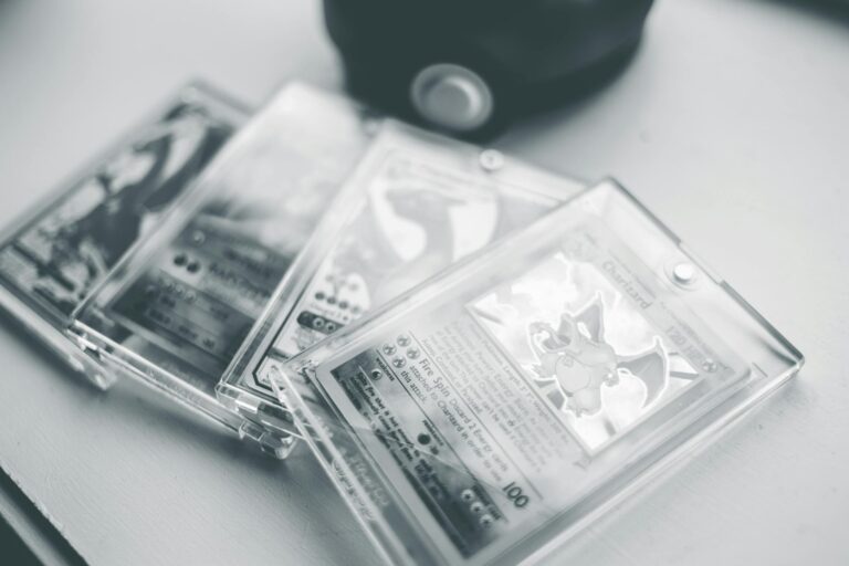
Pokémon Base Set cards from the very first print runs in 1999 have some clear font differences that help collectors tell them apart from later ones. These changes happened because the printing process evolved over time, starting with the rarest “1st Edition” and “Shadowless” versions and moving to “Unlimited” prints with crisper, more uniform text.
Let’s start from the beginning. The Base Set was the launch of the Pokémon Trading Card Game in English, printed by Wizards of the Coast right after the Japanese version took off. The first batch, called the 1st Edition, came out in January 1999 and only lasted a short while. These cards have a special black stamp in the bottom left corner that says “1st Edition” in a blocky, bold font. That stamp’s letters are thick and a bit uneven because the ink was applied by a separate machine after the main card printing. Sometimes the stamp bled or shifted slightly, making the edges fuzzy or trailing off.[2] The main text on the card, like the Pokémon name at the top or the attack descriptions, uses a custom font that’s slightly bolder and more spaced out compared to what came later. For example, the word “Pokémon” in the logo has thicker strokes on the P, o, k, and é, giving it a heavier look that’s easy to spot if you hold two cards side by side.[1]
Right after 1st Edition, they printed the Shadowless run, which is still super rare and valuable. Shadowless cards don’t have the “1st Edition” stamp, but their fonts stand out even more. The Pokémon logo lacks the thin black outline or “shadow” that showed up in later prints, so the letters look cleaner but sometimes softer around the edges. Card text, like the HP numbers or weakness types, has wider spacing between letters and words. Take a card like Vulpix – in Shadowless prints, it says “HP 50” instead of the standard “50 HP,” and the numbers are in a blockier font with less kerning, meaning the space between characters feels looser.[2] This quirk comes from early printing plates wearing down, causing ink to spread just a tad. Collectors love these because fakes often mess up that exact spacing.[1]
As they ramped up production, Wizards switched to Unlimited prints around mid-1999. These added the shadow back to the Pokémon logo, making the letters pop with a thin black outline that sharpens everything up. The font got refined too – letters are thinner overall, and spacing tightens up for a neater look. Attack names and flavor text read smoother, with consistent thickness across the whole card. No more of those bold, spaced-out vibes from Shadowless. For instance, on Hitmonlee cards from early runs, some had ink stains bleeding into the text like “Stretch” in its attack name, but Unlimited fixed that with cleaner fonts and no extras.[2]
Things got even more interesting with international prints. The UK got its own Base Set runs in 1999-2000, and the 4th print there corrected errors from earlier ones. Vulpix finally got “50 HP” instead of “HP 50,” and the font matched the crisp Unlimited style but with a slight yellow ink shift on some commons – the text might look warmer or shifted rightward.[2] These UK versions used the same font family as US Unlimited but printed on slightly different stock, so the letters can appear a hair bolder due to ink density.
Why do these font tweaks matter so much? Early print runs used metal plates that wore out fast, leading to fading ink and bolder initial fonts that smoothed out over time. By Unlimited, they switched to better tech for consistent results.[1] Spotting fakes is easier with this knowledge – knockoffs often have fonts that are too thin, too pixelated, or misspelled, like missing accents on “Pokémon.”[5] Real early cards feel premium because the text aligns perfectly with the artwork borders, which were thicker on 1st Edition.[4]
Diving deeper into specific cards shows how fonts varied run by run. Charizard, the king of Base Set holos, has its name in a super bold font on 1st Edition and Shadowless, with the C and z strokes extra thick. Unlimited Charizards slim those down and add the shadow, making it look more polished.[1] Blastoise follows suit – early prints have attack text like “Hydro Pump” with generous letter spacing, almost airy, while later ones pack it tighter. Venusaur’s weakness text shifts from a blocky “G” for Grass in Shadowless to a sleeker one in Unlimited.
Not every card changed the same way. Commons and uncommons from the first sheets often show the boldest fonts because the plates were fresh. As the print sheet progressed, ink thinned, making text fainter on the same run – that’s why some Shadowless cards have “diminishing ink” where the bottom text looks lighter.[2] Holos added complexity with foil stamping over the font, so early ones have a subtle glow bleed into letters, unlike the sharp overlay in Unlimited.
Print run identification goes beyond fonts to pair with them. 1st Edition: stamp plus bold fonts. Shadowless: no stamp, no logo shadow, loose spacing. Unlimited: stamp gone, logo shadowed, tight fonts. UK 4th print: corrected text like proper HP order, yellow-tinged but sharp.[2] Thickness plays in too – early cards are a smidge thicker with a glossier finish that makes fonts shine differently under light.[1]
For serious collectors, comparing a 1st Edition Alakazam to its Unlimited twin reveals it all. Early Alakazam’s “Psychic” type symbol has rounded edges on the font, while Unlimited squares them off. The energy costs in attacks use numerals that are taller and wider initially, shrinking later. These aren’t random; they’re tied to plate swaps mid-print.[2]
Error cards amp up the font fascination. “Stainmonlee” Hitmonlee had gold ink stains over text in tiny 1st Edition batches, distorting letters uniquely.[2] Dark Golbat from Team Rocket sets (post-Base but related) had “Pokémon.Apply” smushed together, fixed in later prints with proper spacing.[2] Base Set fed into Jungle and Fossil, where fonts carried over but refined further – Jungle holos kept Shadowless traits briefly.
Grading services like PSA scrutinize these fonts closely. A Shadowless card with perfect bold spacing grades higher because it proves authenticity. Fakes trip up on kerning – the space between A and V in “Vaporeon,” for example, is too even on counterfeits.[5]
Handling these cards teaches patience. Use a magnifier to check stroke width on the e in Pokémon – early runs have a fatter tail. Light test: hold to a lamp; early fonts diffuse light more due to ink variance.[1] Storage matters too – humidity warps early thick stock, blurring fonts over decades.
Modern reprints like Base Set 2 from 2000 mash up Base and Jungle with a silver “2” border and updated fonts that mimic Unlimited but feel off t