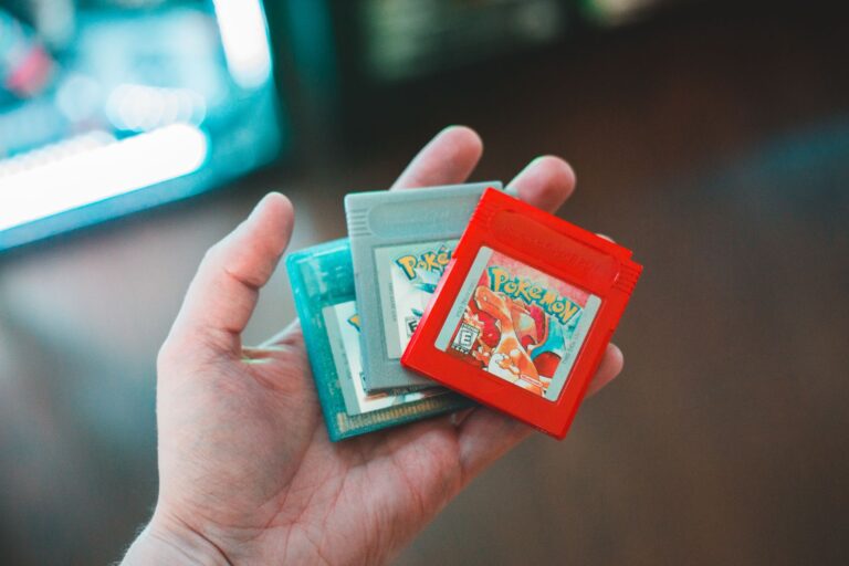
Early Wizards of the Coast Pokemon card printing was inconsistent primarily because the company was caught off guard by unprecedented demand and had to rapidly scale production across multiple printing facilities with varying quality control standards. When Pokemon cards launched in the United States in January 1999, WOTC expected moderate hobby game sales similar to their Magic: The Gathering product””instead, they faced a cultural phenomenon that required emergency production measures, including contracting with multiple print houses that used different equipment, ink formulations, and card stock. The most visible evidence of this inconsistency appears in Base Set Unlimited cards, where collectors can find noticeable differences in color saturation, holo pattern brightness, and card thickness depending on which print run they examine.
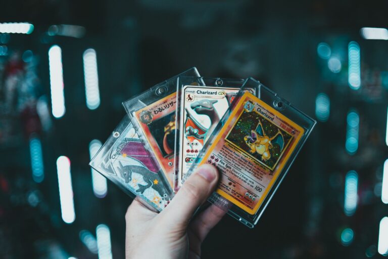
A Charizard from an early 1999 print run often displays richer yellow borders and more vibrant holo patterns compared to later runs from the same “Unlimited” designation. This wasn’t a design choice””it was a byproduct of production chaos during the most intense trading card boom in American history. This article explores the specific factors behind WOTC’s printing inconsistencies, including the role of multiple printing facilities, the evolution of quality control, regional production differences, and how these variations affect collectors and card grading today. Understanding these printing nuances is essential for anyone evaluating early WOTC cards, whether for personal collecting or investment purposes.
Table of Contents
- What Caused WOTC Pokemon Printing Quality to Vary So Dramatically?
- How Different Print Facilities Created Regional Card Variations
- The Evolution of WOTC Quality Control from Base Set to Neo
- Common Print Defects Versus Intentional Production Differences
- How Print Inconsistencies Affect Modern Card Grading
- Long-Term Collector Implications of Production Variations
- Conclusion
What Caused WOTC Pokemon Printing Quality to Vary So Dramatically?
The root cause was WOTC’s reliance on multiple third-party printing companies to meet explosive demand. Unlike companies with dedicated in-house printing facilities, WOTC contracted with established trading card printers including Cartamundi in Belgium and various domestic U.S. printers. Each facility operated with its own proprietary processes, and while WOTC provided specifications, the execution varied significantly. One printer might use a slightly runs-have-different-weight-baselines/” title=”Why Different WOTC Print Runs Have Different Weight Baselines”>different cyan-magenta-yellow-black ink ratio, resulting in cards with cooler or warmer color profiles across entire print runs. Production scheduling also contributed to inconsistency.
When WOTC needed emergency print runs to restock shelves during the 1999 holiday season, quality control took a back seat to speed. Cards from these rush production periods often show thinner card stock, less precise cutting, and duller holographic foil application. The company simply didn’t have the infrastructure to maintain consistent standards while simultaneously scaling from a niche hobby game publisher to a mass-market phenomenon. Comparing a 1st Edition Base Set Machamp to an Unlimited version from late 1999 reveals these differences clearly. The 1st Edition cards, printed in smaller quantities with more careful oversight, typically display sharper text, more consistent centering, and richer color depth. The Unlimited cards, produced under pressure, show wider variation in every measurable quality metric.

How Different Print Facilities Created Regional Card Variations
WOTC’s international distribution strategy amplified printing inconsistencies by introducing geographic production differences. Cards destined for the U.S. market were primarily printed domestically, while European distribution relied heavily on Cartamundi’s Belgian facility and, later, additional European printers. Australian and Asian English-language cards came from yet other sources. Each regional production stream developed its own characteristic “look” that experienced collectors can identify. European base Set cards, for example, typically feature slightly different color calibration than their American counterparts, with many collectors noting a tendency toward deeper blues and more saturated reds.
The card stock also differs””European prints often feel slightly thicker and have a different texture to the touch. These aren’t defects, but rather the natural result of different printing equipment and material suppliers operating under the same general specifications. However, if you’re attempting to complete a set using cards from mixed regional sources, be aware that these variations may be visible when cards are displayed side by side. A binder page mixing U.S. and European prints can look oddly mismatched despite all cards being genuine WOTC products from the same set release period. For collectors prioritizing visual consistency, sourcing cards from a single regional print run is worth the additional effort.
The Evolution of WOTC Quality Control from Base Set to Neo
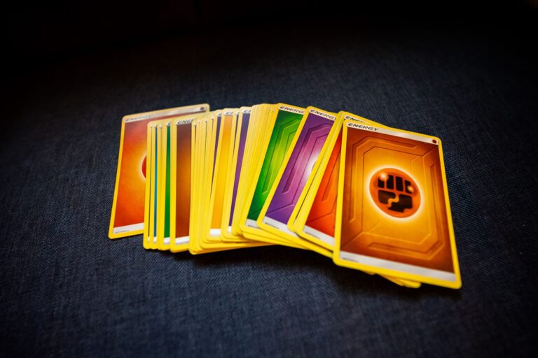
Quality control improved measurably as WOTC gained experience and established more standardized printing protocols. The difference between early Base Set production and cards from the Neo series (2000-2002) is substantial enough that grading companies report significantly different population distributions. Neo Genesis cards, for instance, show much tighter centering tolerances and more consistent ink application than Base Set Unlimited cards produced just eighteen months earlier. This evolution happened incrementally. By the time Jungle and Fossil sets entered production in mid-1999, WOTC had implemented better quality checkpoints, though issues persisted. The Jungle set’s infamous “no symbol” error cards””where the jungle symbol was omitted from the card””demonstrate that quality control still had gaps. Team Rocket set in 2000 showed further improvement, with more consistent holographic application and fewer dramatic color shifts between print runs. A specific example illustrates this progression: comparing holographic energy cards across sets reveals the improvement trajectory. Base Set holo energy cards display substantial variation in foil brightness and pattern clarity. By Neo Discovery, the holographic consistency had improved dramatically, with far less variation between individual packs, let alone print runs.
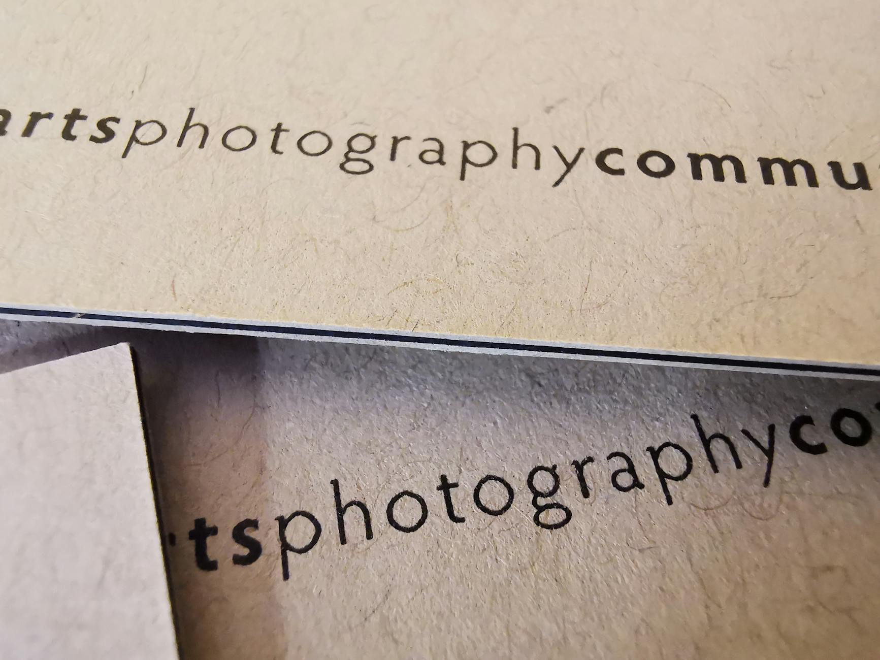
## How to Identify Different WOTC Print Runs When Buying Cards Identifying print run variations requires attention to several observable characteristics that experienced collectors use to date and source cards. Border color saturation provides the most immediately visible indicator””early Base Set prints typically show richer, more golden-yellow borders, while later prints trend toward a paler, almost cream-colored yellow. This “border test” works best when comparing cards side by side, as individual cards can be difficult to assess in isolation. Card stock thickness varies enough between print runs that many collectors can feel the difference. Early prints tend toward thicker, stiffer card stock, while later production runs””especially those from 1999’s high-demand period””often used thinner material. The difference affects how cards respond to humidity and handling, with thinner stock being more susceptible to warping. some collectors use calipers to measure thickness when evaluating high-value cards, with early prints typically measuring 0.32mm or thicker and later prints sometimes dropping below 0.30mm. The tradeoff for collectors is between authenticity verification and practical usability. A card with unusual characteristics might be a valuable early print run variant or might indicate damage, counterfeiting, or storage issues. Learning to distinguish print run variations from problems requires handling many genuine examples and, when stakes are high, relying on professional grading services that specifically document print run characteristics in their assessments.
Common Print Defects Versus Intentional Production Differences
Distinguishing between print defects and production variations remains challenging even for experienced collectors, and this confusion affects both buying decisions and grading outcomes. A card with noticeably off-center printing might represent a quality control failure (a defect that reduces value) or might be characteristic of an entire print run where centering standards were different. Without comparative data from the same production batch, making this determination is difficult. Ink errors present particular challenges.
The “grey stamp” 1st Edition cards””where the 1st Edition stamp appears grey rather than black””were initially thought to be defects but are now recognized as a legitimate production variant from specific print runs. Similarly, certain Base Set cards consistently appear with slightly different background colors, leading to ongoing debates about whether these represent errors, variants, or simply acceptable variation within WOTC’s specifications. The warning for collectors is that assuming any unusual characteristic adds value is risky. While some print variations command premiums””shadowless prints being the obvious example””others are simply quality control failures that reduce desirability. Before paying extra for a “rare variant,” research whether the variation is documented, reproducible across multiple examples, and recognized by grading companies and serious collectors.
How Print Inconsistencies Affect Modern Card Grading
Grading services face ongoing challenges when evaluating early WOTC cards because their centering and quality standards must account for legitimate production variations. PSA, BGS, and CGC have all developed internal guidelines for handling cards from print runs known to have systemic issues””for example, certain Jungle holos that were consistently off-center across entire production batches may be graded against different standards than cards from better-controlled runs.
This creates situations where two cards with identical physical characteristics might receive different grades depending on whether graders identify them as coming from problematic print runs. A Base Set Blastoise with 55/45 centering might grade differently than a Neo Genesis Lugia with the same centering because the grader understands that early Base Set tolerances were wider. Collectors should be aware that grading, for early WOTC cards especially, involves subjective assessments of production context that aren’t always transparent or consistent between graders.
Long-Term Collector Implications of Production Variations
For collectors building long-term holdings, understanding WOTC print run variations provides both opportunities and complications. Certain production runs””particularly early Base Set prints and verified 1st Edition runs””maintain premium values partly because of their superior printing characteristics, not just their chronological precedence. As the market matures, expect increasing price stratification based on print run identification and quality characteristics.
The collecting community continues developing better documentation of print run variations, with online databases cataloging observable differences between production batches. This knowledge asymmetry creates opportunities for informed buyers to acquire superior examples at market prices, while uninformed sellers may discount cards that are actually more desirable than average. For serious collectors, investing time in learning print run identification pays dividends across every transaction.
Conclusion
WOTC’s early Pokemon card printing inconsistencies resulted from the collision between unprecedented demand and limited production infrastructure. Multiple printing facilities, varying quality control standards, rushed production schedules, and evolving technical capabilities combined to create cards with noticeable variations in color, thickness, centering, and holographic quality. These weren’t intentional design choices but rather the unavoidable consequences of scaling a niche hobby product into a global phenomenon within months.
For today’s collectors, this history matters because it directly affects card evaluation, grading, and pricing. Understanding which variations are legitimate production differences versus defects, learning to identify print runs, and knowing how grading companies handle these issues are essential skills for anyone buying, selling, or holding early WOTC Pokemon cards. The inconsistencies that frustrated WOTC in 1999 have become part of the collecting challenge””and opportunity””that makes early Pokemon cards such an engaging market today.