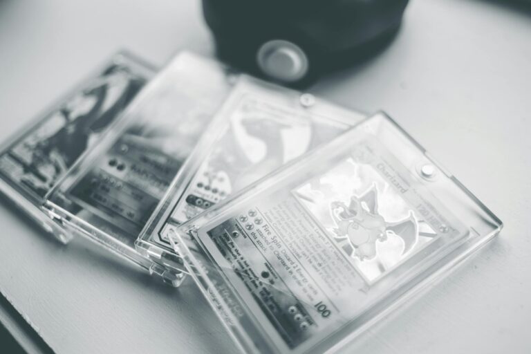
Imagine holding two legendary Pokémon cards in your hands: a 1st Edition Charizard from the original Base Set and a 4th print Charizard from the same set. These are both holofoil versions of card number 4, the fire-breathing dragon that collectors dream about. The 1st Edition is from the very first batch printed in English by Wizards of the Coast back in 1999, while the 4th print comes much later in the production run, often called a “revised” or unlimited version with specific changes that make it stand out from the early ones. Comparing them side by side is like spotting the difference between a rare gem and a common copy, and it can tell you right away if something is real or fake, or just help you understand why one is worth thousands more than the other. People pay huge money for these— a PSA 10 graded 1st Edition recently hit over half a million dollars, while lower grades still fetch tens of thousands.[1][4]
To start your side-by-side comparison, grab a good light source, like a bright desk lamp or even sunlight near a window, and maybe a magnifying glass or a jeweler’s loupe if you have one. Lay both cards flat on a soft, clean surface, like a microfiber cloth, to avoid scratches. Position them right next to each other so the artwork lines up perfectly. The goal is to check every tiny detail step by step, from the front stamp to the back patterns, because fakes often mess up these spots.
First, look at the bottom left corner of the card’s front, right below the artwork. This is where the big difference jumps out. The 1st Edition has a black oval stamp that clearly says “1st Edition” in white letters. It’s crisp and bold on a real one, placed about a centimeter from the bottom edge and not overlapping the yellow border at all. On the 4th print, there’s no stamp at all— that spot is just plain yellow border, smooth and unmarked. Hold them side by side under the light: the 1st Edition stamp should look raised slightly, like it’s printed on top of the card, not smudged into it. Fakes sometimes have blurry stamps or ones that bleed into the border, but a true 1st Edition stamp is sharp, with even spacing between the letters. Wizards of the Coast only put this on the first wave of cards before switching to unlimited prints, making 1st Editions way rarer— only about 5,000 have ever been graded by PSA, compared to tons more of the later prints.[1][2]
Next, slide your eyes up to the border around the artwork. The 4th print has a solid black shadow line running along the entire edge of the illustration area, making the holo pattern pop against a dark outline. Flip to the 1st Edition, and that shadow is gone— no black line at all, just the shiny holo foil blending right into the white space. This “shadowless” look is actually shared by early prints, including most 1st Editions, but by the 4th print run, Wizards added the shadow to make cards easier to cut and handle in factories. Side by side, it’s night and day: the 4th print looks bolder and more defined, while the 1st Edition has a cleaner, airier feel. Shine the light at an angle here— the holo on both should rainbow-shift from blue to green to purple, but the 4th print’s black shadow makes the colors snap more sharply.[2]
Now, zoom in on the artwork itself, that epic picture of Charizard roaring with flames. Both cards use the same Ken Sugimori illustration, but check the fine details like the flames and scales. On a real 1st Edition, the orange and yellow flames have crisp edges without fuzzy bleeding, and Charizard’s wings show clear vein patterns. The 4th print matches this closely, but sometimes later prints have slightly thicker ink lines from wear on the printing plates. Look for the drop shadow behind Charizard’s head— it should be soft and even on both, but fakes often make it too dark or blocky. Also, peek at the evolution box in the top right, showing Charmander, Charmeleon, and Charizard. The pictures are identical, but the text “Evolves from Charmeleon” is in a clean font on both. Under magnification, the 1st Edition’s text might look a hair sharper because of fresher plates used early on.[3]
Move to the text box in the middle, where the attacks are listed. Fire Spin costs 3 Fire Energy and does 50 damage plus 50 more if all energy are Fire. Energy Burn is the big one: discard all energy from Charizard and your opponent’s active Pokémon to do 100 plus 40 per energy discarded. Both prints have the same wording, but compare the energy symbols. They should be bright orange Fire icons, perfectly round with a clear flame inside. No differences here between 1st and 4th print, but this is a spot fakes butcher— Chinese counterfeits often use dull purple or off-shape symbols. Side by side, match them exactly; if the 1st Edition’s symbols glow brighter under light, that’s normal from early foil quality.[1]
The copyright line at the very bottom is another key spot. Both say “© 1995, 96, 98, 99 Nintendo, Creatures, GAMEFREAK,” but check the edition mark. Nope, not there— the 1st Edition doesn’t repeat the stamp here. Instead, look for print quality: the 1st Edition text is razor-thin and evenly spaced, while 4th prints can have tiny dots from dot-matrix printing wear. Also, scan for errors— some early 1st Editions have rare misprints like a ring in the stamp making it look like “d Edition,” but that’s super uncommon and adds value if real.[3]
Flip both cards over to the backs. This is where print runs really show. The 1st Edition back has a lighter, more vibrant blue color overall, with the Wizards of the Coast logo and fine print looking crisp. The 4th print back is noticeably darker blue, almost navy, and the texture feels a bit smoother from later paper stock. Hold them up to the light together: both should have the same thin black border framing the back text, but the 1st Edition often shows subtle horizontal lines from the printing press, while 4th prints are more uniform. Check the fine print at the bottom— “Base Set” symbol and legal text match, but the 1st Edition’s ink doesn’t bleed under magnification.[2][3]
Feel the cards between your fingers next. Real 1st Editions have a slightly thicker, stiffer stock with a subtle linen texture, like fine canvas. The 4th print is thinner and smoother, easier to shuffle. Bend them gently (don’t crease!) side by side— the holo foil on 1st Editions crackles less and holds its shine better. Weight them too: 1st Editions tip the scale a tad heavier du