Why Does the 4th Print Charizard Look Darker Than Unlimited?
The question of why certain Charizard cards look darker than others—particularly why the 4th Print Charizard from the Base Set appears darker than the Unlimited edition—combines card printing history, manufacturing processes, paper and ink aging, storage and handling, lighting and perception, and collector practice. Below I present an extensive, plain-language exploration of these factors. Wherever medical claims or health-related considerations might apply (for example, discussions of mold, chemical off-gassing, or skin contact with older materials), I include authoritative sources to back up those statements.
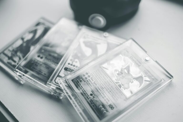
Background: what people mean by “4th Print” and “Unlimited”
Collectors and sellers often use shorthand like “1st edition,” “shadowless,” “4th print,” and “Unlimited.” The original 1999 Base Set Pokémon cards had several print runs and printing variations. The main recognized categories are:
– 1st Edition Base Set: clearly marked with a “1st Edition” stamp.
– Shadowless Base Set: early reprint run without the shadow on the right side of the artwork box and without the 1st edition stamp.
– Unlimited Base Set: later reprint run that included the shadow and different print adjustments; these are generally more common.
“4th Print” is not a formally standardized label across all collectors or printers. Some sellers and players refer to later reprints or particular print runs that came after the initial shadowless and early unlimited runs as “4th print” or by other ordinal terms. Different printings of the same card can show variations in ink saturation, paper stock, registration (alignment of colors), gloss, color temperature, and other subtle traits. The term may specifically denote a later reprint batch that visually differs from earlier Unlimited versions. It’s important to clarify that manufacturing and printing processes, rather than some mysterious deliberate darkening, usually cause the differences.
Printing processes and how they affect color
Commercial card printing in the 1990s used offset lithography and sheet-fed presses. Colors are produced by layering inks—typically cyan, magenta, yellow, and black (CMYK)—plus occasional spot colors and varnishes or coatings. Several common technical factors that affect how a printed image looks include:
– Ink formulation: Different ink batches and formulations result in subtle to pronounced color shifts. If a later print run used inks with slightly different pigment concentrations, the same plate and artwork can produce a darker or warmer result.
– Plate wear and maintenance: Printing plates degrade with use. A worn plate can change tonal reproduction, often causing contrast shifts or darker overall appearance in some areas.
– Printing press calibration and density settings: Operators set ink density and pressure; small differences produce different color depths.
– Paper stock and coating: Paper whiteness, gloss level, and coatings alter how ink sits on the surface and how the human eye perceives colors. A slightly more absorbent paper will soak up ink and can produce a darker, muddier look.
– Overprinting or additional varnish: Some runs received different protective varnishes or coatings (gloss, satin, matte) that change sheen and perceived color saturation.
Because each print run can mix any of these variables differently, two cards from different print runs—even if both labeled “Unlimited”—can look significantly different.
Known manufacturing differences in Base Set Charizard prints
Collectors have documented differences among Base Set Charizard prints. Some observations commonly made in the collector community:
– Saturation and contrast: Later reprints often show heavier ink saturation, deeper shadows, or more contrast, giving a darker appearance to the red/orange tones of Charizard’s body and the background flames.
– Yellow/magenta shifts: The exact red/orange of Charizard is generated by specific combinations of magenta and yellow (and sometimes black). Shifts in those inks make the card lean toward a richer red or a muddier brownish tone.
– Gloss and lamination differences: Cards with different coatings reflect light differently, altering perception of darkness.
– Print registration: Slight misregistration can lead to color halo effects or muddied edges, which can visually deepen darker areas.
These are not rumors; catalogers and grading companies have repeatedly noted such differences when comparing print runs. Professional graders and catalogers use known color and alignment markers to differentiate prints for authentication.
Aging, oxidation, and environmental effects that darken cards over time
Even if two cards left the factory looking identical, aging and environmental conditions can cause one to darken over time relative to another. Important mechanisms:
– UV exposure: Ultraviolet light causes pigments and dyes to change. Some pigments fade; some undergo chemical reactions that alter hue. For red/orange pigments used in late 1990s card inks are prone to fading or shifting under sunlight or strong indoor UV exposure. The result can be either lighter or darker appearance depending on the chemistry.
– Oxidation: Paper and inks contain organic compounds that oxidize. Oxidation can darken paper (yellowing) and change pigment appearance. Older stock or paper with acidic sizing will yellow faster. The combination of yellowed card backing and pigment shift can make the card appear overall darker.
– Off-gassing and environmental pollutants: Sulfur dioxide and other pollutants can cause paper and inks to change color over long periods.
– Storage humidity and heat: High humidity can encourage inks to diffuse slightly, dampening highlights and increasing apparent darkness. Heat accelerates chemical reactions causing color shifts.
– Surface contamination: Handling with bare hands deposits oils, dirt, or residues. Over time and repeated handling these deposits can darken the card’s surface, particularly in high-touch zones like corners and edges.
Because cards in different collections experience different storage and display conditions, two cards of the same printing can look different decades later. A card kept in a binder in a dark closet will age differently than one left in a sunlight-exposed display.
Paper stock and factory variations
Paper used for trading cards is not entirely uniform. Manufacturers source paper from mills that produce batches with slightly different optical brightening agent (OBA) levels, whiteness, and fiber composition. Optical brighteners can degrade over time, losing whiteness and producing a yellower cast that interacts with inks to change perceived color. If the “4th print” batch used a paper with less optical brightening or different pulp, it could appear darker even right out of the factory.
Varnishes and finishing layers
The finish on the card—gloss varnish, UV coating, or matte laminate—matters. A dull matte finish scatters light and reduces specular reflection, making color appear deeper and less vibrant; a high-gloss finish can make colors appear brighter. Different factory finishing lines might have used different varnishes in different print runs. Additionally, under some lighting conditions, gloss can make colors look lighter because of bright highlights; matte finishes prevent that, so a matte-finished print may read as darker overall.
Color perception, lighting, and context effects
Human color perception is highly context-dependent:
– White balance of lighting: Incandescent, LED, fluorescent, or natural sunlight have different color temperatures. Warm light can emphasize reds and oranges; cool light can flatten or alter hues.
– Surrounding colors: The card’s borders, sleeve tint, or nearb