Why Do 4th Print Cards Have Lighter Ink or Different Texture
In the world of Pokemon trading cards, especially older sets like the original Base Set from 1999, collectors often notice something odd about cards marked as “4th print.” These cards tend to show up with ink that looks noticeably lighter, colors that seem washed out, or a texture on the surface that feels different from earlier prints like 1st edition or 2nd print versions. This isn’t some random flaw or fake card trick. It comes down to how the cards were made back in the early days of mass printing, when factories were cranking out millions of these things under tight deadlines using big industrial presses that sometimes didn’t play nice with the materials.
To get why this happens, you have to picture the printing process step by step. Pokemon cards aren’t just printed on plain paper like a coloring book. They start with a thick cardstock base, kind of like heavy poster board, that’s cut into sheets holding dozens of cards at once. These sheets go through giant offset printers, which are machines that layer colors one by one using metal plates and wet ink. First comes the black ink for outlines and text, then layers of cyan, magenta, yellow, and sometimes special metallic foils for those shiny holo cards. For non-holo cards, it’s mostly those four colors building up the artwork. The whole sheet gets baked or dried under heat lamps or fans to set the ink before flipping over for the back print and stamping things like the edition mark.
Early prints, like the super rare 1st edition stuff from January 1999, used fresh ink batches mixed to exact specs. The factory in Belgium, run by Carta Mundi for Wizards of the Coast, had everything dialed in perfectly at first. But as demand exploded, they kept the presses running non-stop, printing wave after wave. By the time they hit later waves, what collectors call “3rd print,” “4th print,” or even “5th print,” things started to shift. These print runs aren’t officially labeled on the cards except for 1st edition, which has that little stamp in the bottom left. Later ones just say “Unlimited” at the bottom, but savvy collectors spot them by tiny clues like the shadow under the character art or the exact shade of the energy symbols.
One big reason for lighter ink on 4th print cards is ink depletion. Imagine squeezing the last bit of toothpaste from a tube. Printers have ink reservoirs that get refilled periodically, but during a long run, the mix can thin out. Black ink, in particular, starts to fade first because it’s used heaviest for borders and text. On 4th print Base Set commons and uncommons, you’ll see the black outlines around the picture box looking grayish instead of crisp black, and the text at the bottom might read faint, like someone turned down the contrast on a TV. This matches up with reports of “low black ink holos” from unlimited prints, where even the gold frame around the art looks brighter and less bold because the black layer didn’t stick as thick.[1] It’s not that they used cheap ink; it’s just the batch running low midway through the 4th wave, so the press laid down less per pass.
Texture differences pop up for similar reasons, tied to drying times and pressure. Wet ink needs time to set before the next color hits, or it smears. In early prints, everything dried evenly, giving that smooth, slightly glossy feel under your fingers. But on 4th prints, with presses pushing faster to meet holiday demand, sheets sometimes stacked before fully dry. This caused ink transfers, like the famous “ink-smeared 1st edition stamp” where excess wet black ink dragged across the stamp, leaving a thick smear or even a mirror image on the back of the next card in the stack.[1] For 4th prints, you get subtler versions: a slightly rougher texture where ink piled unevenly, or faint drag marks on edges. Feel the surface of a 1st print Charizard versus a 4th print common – the later one might have tiny raised spots or a matte patch where ink didn’t bond perfectly to the cardstock.
Color shifts add to the “lighter” look. Yellow ink, for instance, could misregister slightly in later runs, bleeding rightward or downward like in some UK prints from 1999-2000, making backgrounds look pale.[1] Holo cards amplify this because their shine comes from a foil layer under the ink. If ink is lighter, more foil peeks through, giving a brighter, almost overexposed glow. Non-holos just look washed out overall. Collectors check under bright light: tilt a 4th print, and the colors don’t pop as deep; they skim the surface instead of sinking in.
Printing order matters too. Backs print first, then fronts, so errors often show inverted or transferred from stacking. On 4th prints, you might find “white stamps” where ink lifted off during drying, leaving ghostly pale spots on the edition area or borders.[1] This ties directly to texture – those white areas feel smoother, almost indented, because ink got scrubbed away by friction in the stack.
Why specifically the 4th print? Print waves were huge – Base Set had over 100 million cards printed in waves over months. 1st edition was tiny, maybe 10% of that. 2nd and 3rd were still fresh, but by 4th, wear and tear on plates showed. Plates etch down over time, spreading ink thinner. Ink formulas might’ve been tweaked mid-run for cost or supply issues, leading to lighter pigmentation. Factories aimed for consistency, but 1999 tech wasn’t perfect – no digital presses like today, just analog behemoths prone to drift.
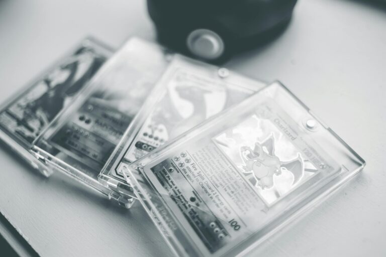
Spotting a true 4th print versus earlier ones takes practice. Look at the 1st edition stamp if present (though 4th prints are usually unlimited). On unlimiteds, check the black under the art: heavy shadow means early print, faint means late like 4th or beyond. Texture test: rub your thumb gently – early prints are uniform silk, later ones have micro-roughness from ink variance. Under magnification, real cards show clean rosette dot patterns in ink, not blurry blobs.[2] Fakes mimic this poorly, often with flat, repeating foil or neon borders.
Value-wise, lighter ink or texture quirks can boost rarity. A 4th print with extreme fading might grade lower for condition but higher for error status, fetching premiums from collectors who chase print variants. Not all 4th prints are equal – some waves hit the sweet spot, others went haywire.
Modern reprints avoid this entirely. Today’s Pokemon cards use digital printing with precise ink control, etched textures for feel, and foil layers that don’t fade.[2] No more wet ink drama. But vintage hunters love the imperfections – they tell the story of a frenzy that started it all.
Dig into print sheets online, and you’ll see photos of full uncut sheets from 4th runs, with gradients of ink density across the page. The left side might b